
BRIEF
imagesound operates in over 160 countries across the globe – partnering with brands in finance, fashion, F&B outlets, and grocery and convenience stores, they needed a new identity that reflected their passion for music alongside their new digital product offerings.
DELIVERABLES
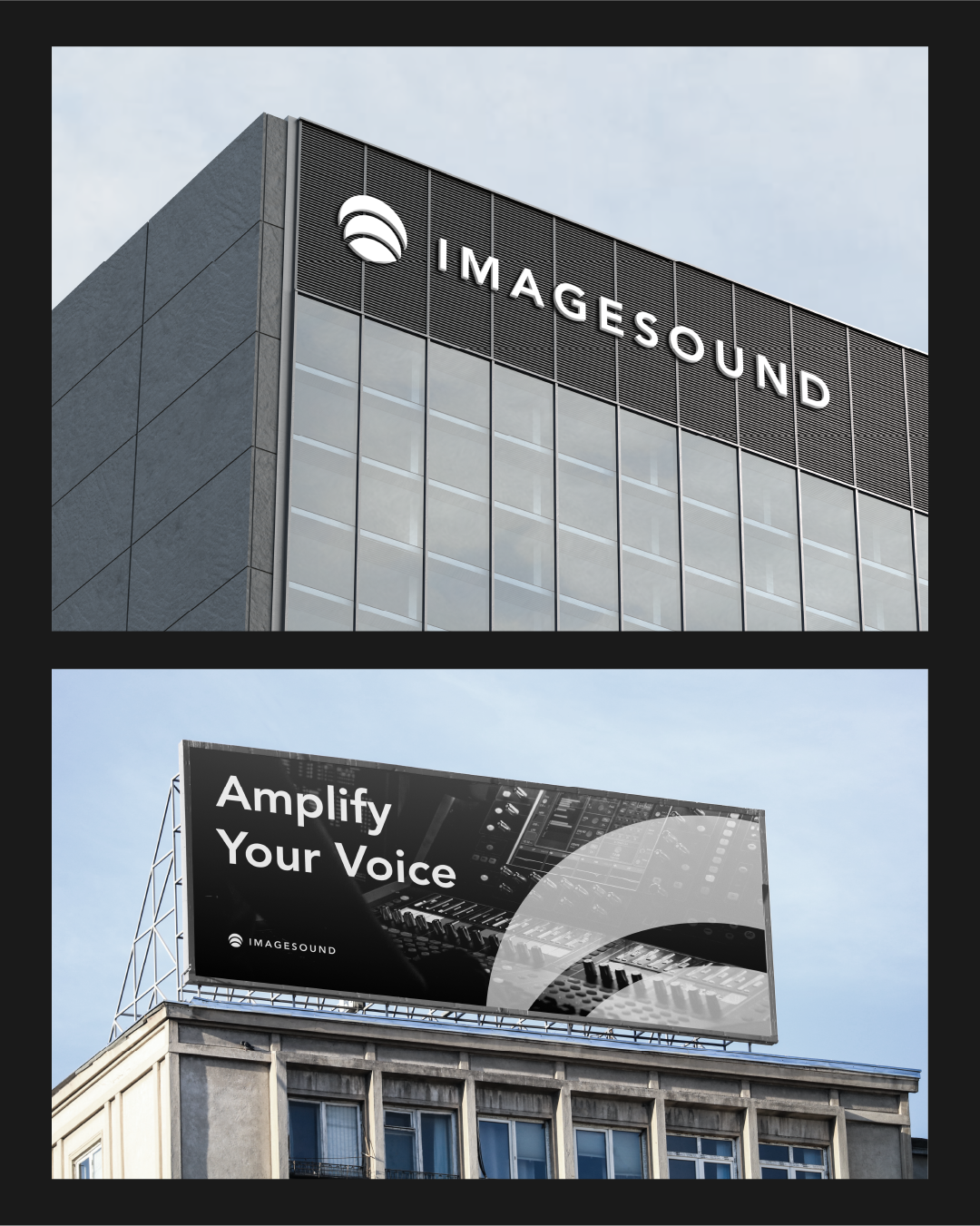
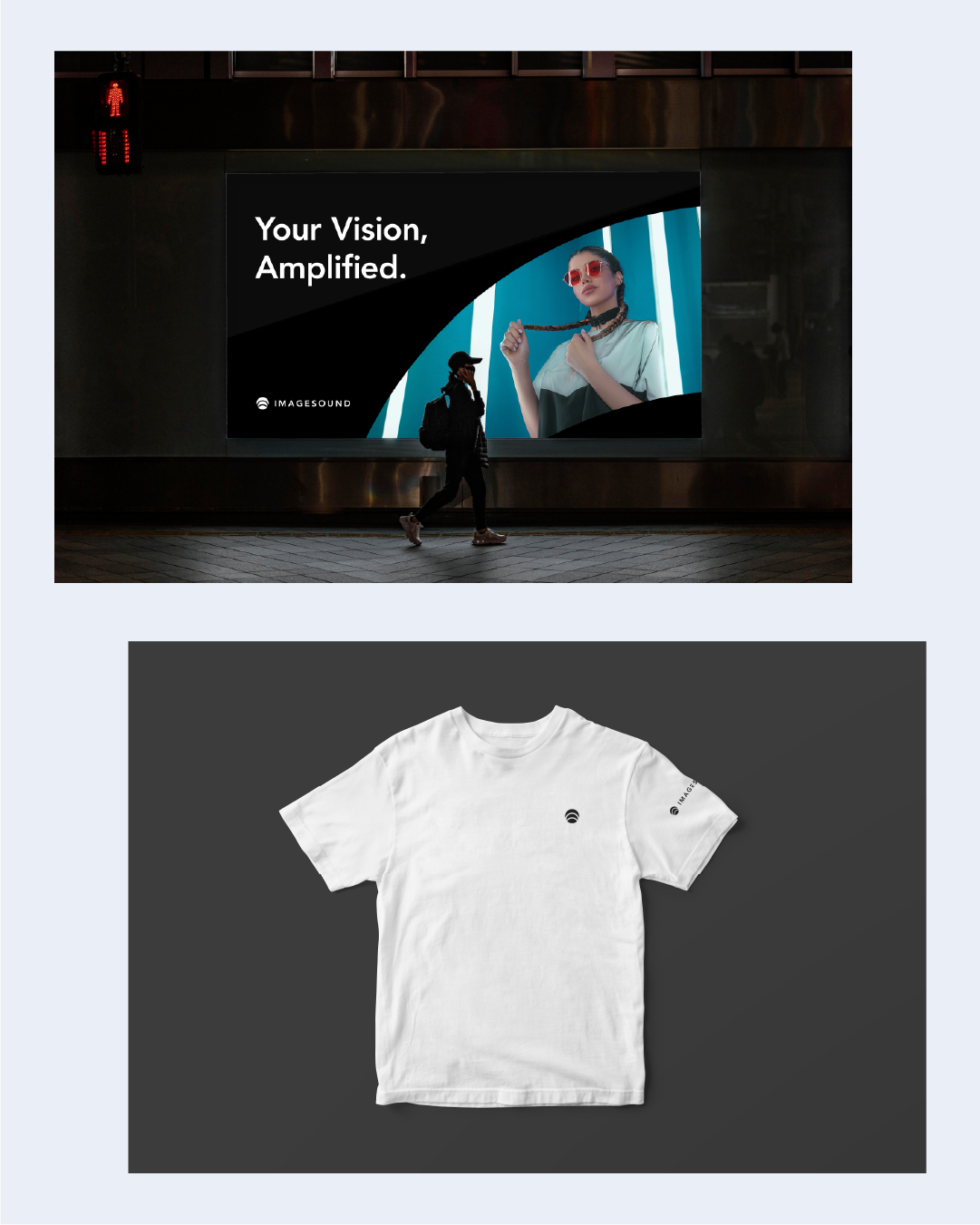
Logo Design
Identity System
Branding Concept

The biggest challenge with this project was figuring out how to represent something you can’t see.

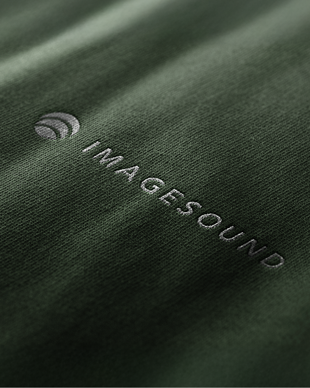
Brand Mark Breakdown


Testing scalability with the favicon
The Outcome
The redesigned mark strategically integrates the core services of the brand—audio and visuals.
Rooted in geometry and simplicity, the symbol is constructed from overlapping ellipses, an evolution of the familiar ‘yellow dot’ into a more dynamic form.
The resulting shape subtly evokes an eye, signifying vision and imagery, while the radiating rings suggest the movement of sound waves. The result is a minimalist, modern symbol that unifies sight and sound.