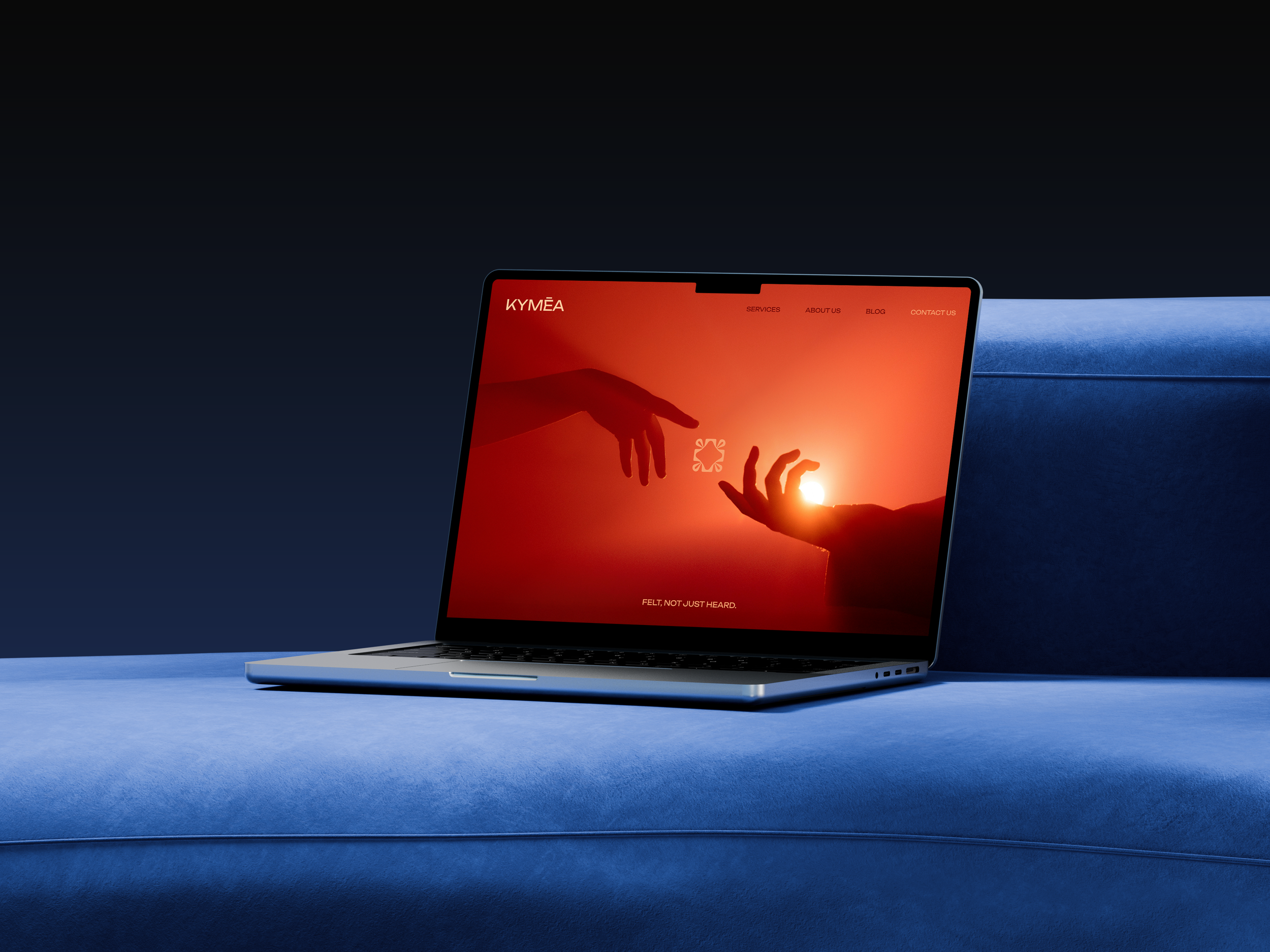
Felt, Not Just Heard.
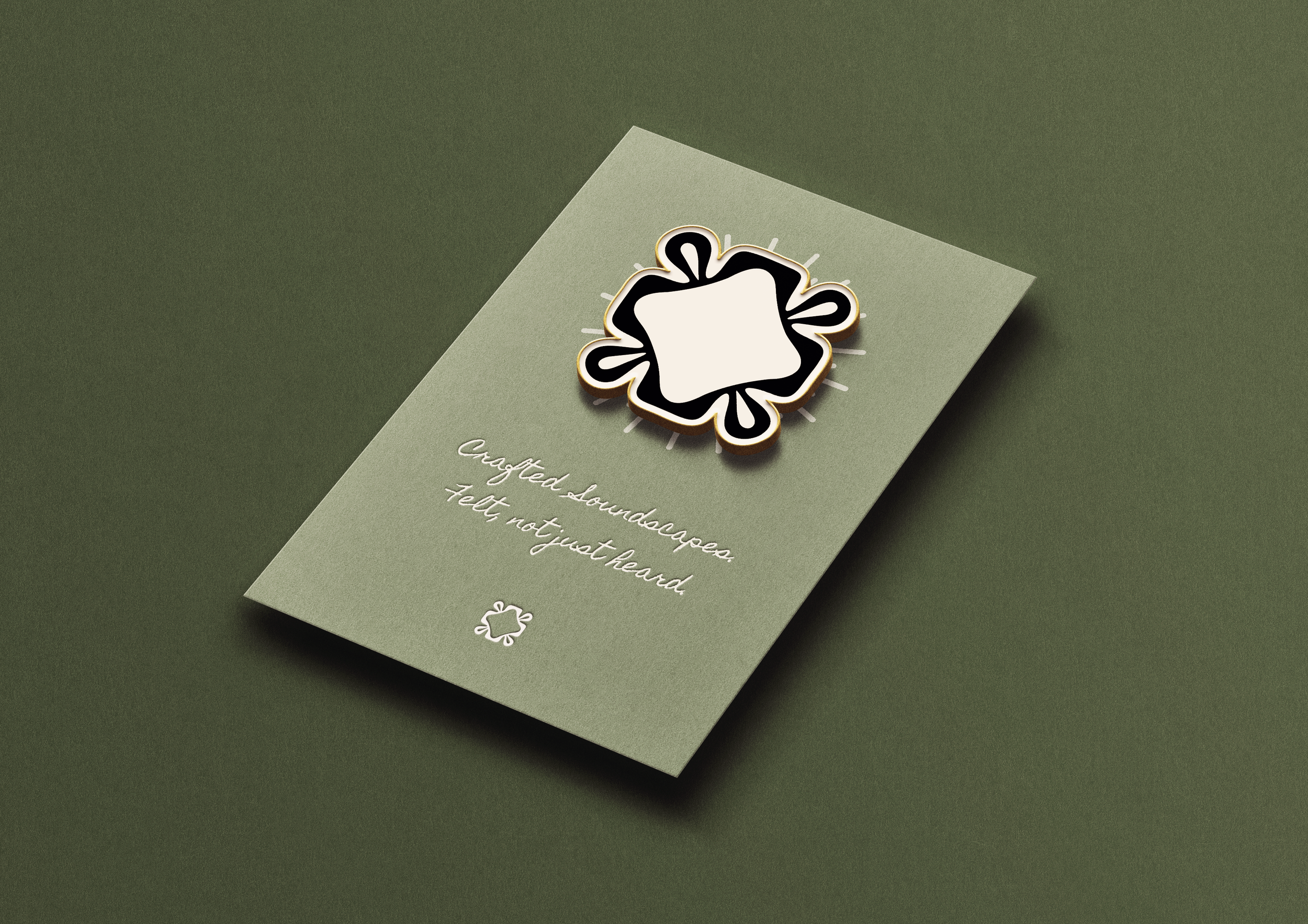
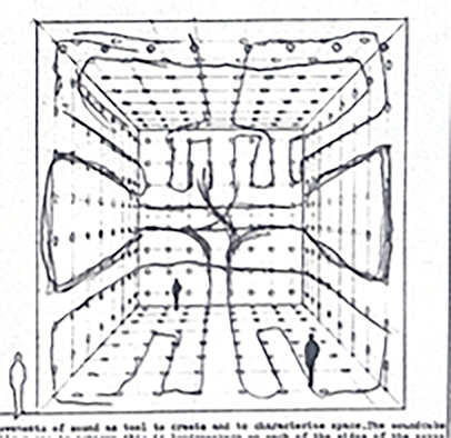
Kymēa is a conceptual luxury music consultancy. The logo design was inspired by Bernhard Leitner’s 1969 Soundcube, which explores sound’s movement in space.
The central challenge of this brief was to visualise something inherently intangible: sound.
In a saturated market where logos often rely on predictable visual tropes such as waveforms, vinyl records, or musical notes, it was essential to move beyond clichés and develop a concept that truly reflects the essence of this conceptual brand.
The brand isn’t just about playing music. It’s about curating experiences—bespoke soundtracks designed to elevate and transform physical environments. When we listen to music, something happens within us. It connects to memory, emotion, and atmosphere. That became the foundation of the concept: the idea that music has a spatial and emotional presence.
Project Scope
Logo Design
Brand Strategy & Art Direction
Brand Identity
Kymēa Logo - Dark
Kymēa Logo - Light


The Design Process
Below are images of Bernhard Leitner’s 1969 Soundcube that explores sound’s movement in space. Using this as a basis for inspiration I began sketching ways to fill the space.


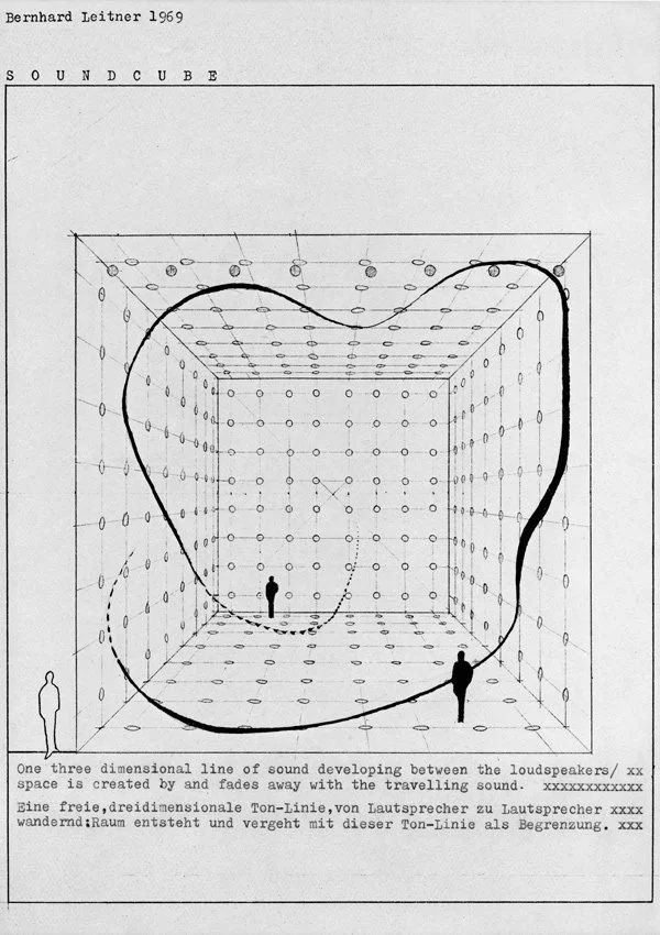

Bernhard Leitner’s 1969 Soundcube
Scans of the sketched concepts
With what felt like limitless options, I asked myself “What are the constraints?”
At its core, the logo needed to communicate the concept of space—not as a static backdrop, but as a dynamic environment shaped by sound. At the same time, music itself is inherently non-linear and deeply personal; it evokes unique emotional responses that differ from person to person.
As such, the identity required an organic quality—something that could suggest fluidity, growth, and transformation, much like the ebb and flow of music.

Digitalising the Sketches
Tracing the Soundcube
Soundcube as a 3D Grid
Logo Creation and Refinement
To achieve this, the form was constructed using variable-width strokes, creating an impression of depth and dimensionality within a two-dimensional framework.
The interplay between rigid geometric angles and soft, fluid curves allowed the mark to feel both structured and adaptable.
This duality supports the idea of the logo as a living form—capable of morphing and expanding to inhabit different contexts, much like how curated sound adapts to and enhances physical environments.